Tuesday, 26 August 2014

Lilla Rogers Global Talent Search

A few weeks ago I came across an amazing competition with the Lilla Rogers illustration agency. Check out their beautiful website here! http://lillarogers.com  They only take on a few new artists a year, and this competition offered the chance of being represented for two years along with a host of other awesome prizes. I was in!!


Last year they had over 1500 entries in the first round, so I knew I would be up against a huge number of talented and diverse designers. I decided to treat it as an exciting new design challenge and to forget the potential pressure of the task! My main priority was to create something that I was really pleased with that I could continue developing into a new print range.

Our brief was to be inspired by 'Little Terrariums,' and to create a piece of wall art capturing this theme. We could choose any medium to create our canvas and target any market with the design. The only other element we had to include was at least one word of text within the piece.

My mind was filling up with ideas! I started by collecting lots of beautiful imagery on Pinterest and creating a board of inspiration. I was looking at different types of terrariums along with bonsai trees, mushrooms, painters, embroidery, colour palettes, sculpture, glass, ceramics, interior design.... anything that caught my eye!


I knew that I'd want to incorporate a little scene into my terrarium, but what would it be contained within?? I loved these Victorian style glass houses:


And I also loved these antique Demi-John bottles:


I kept both of these in mind when I started some doodling. I decided to approach this challenge by drawing and painting some elements first, then scanning them into the computer to create a digital design with them.

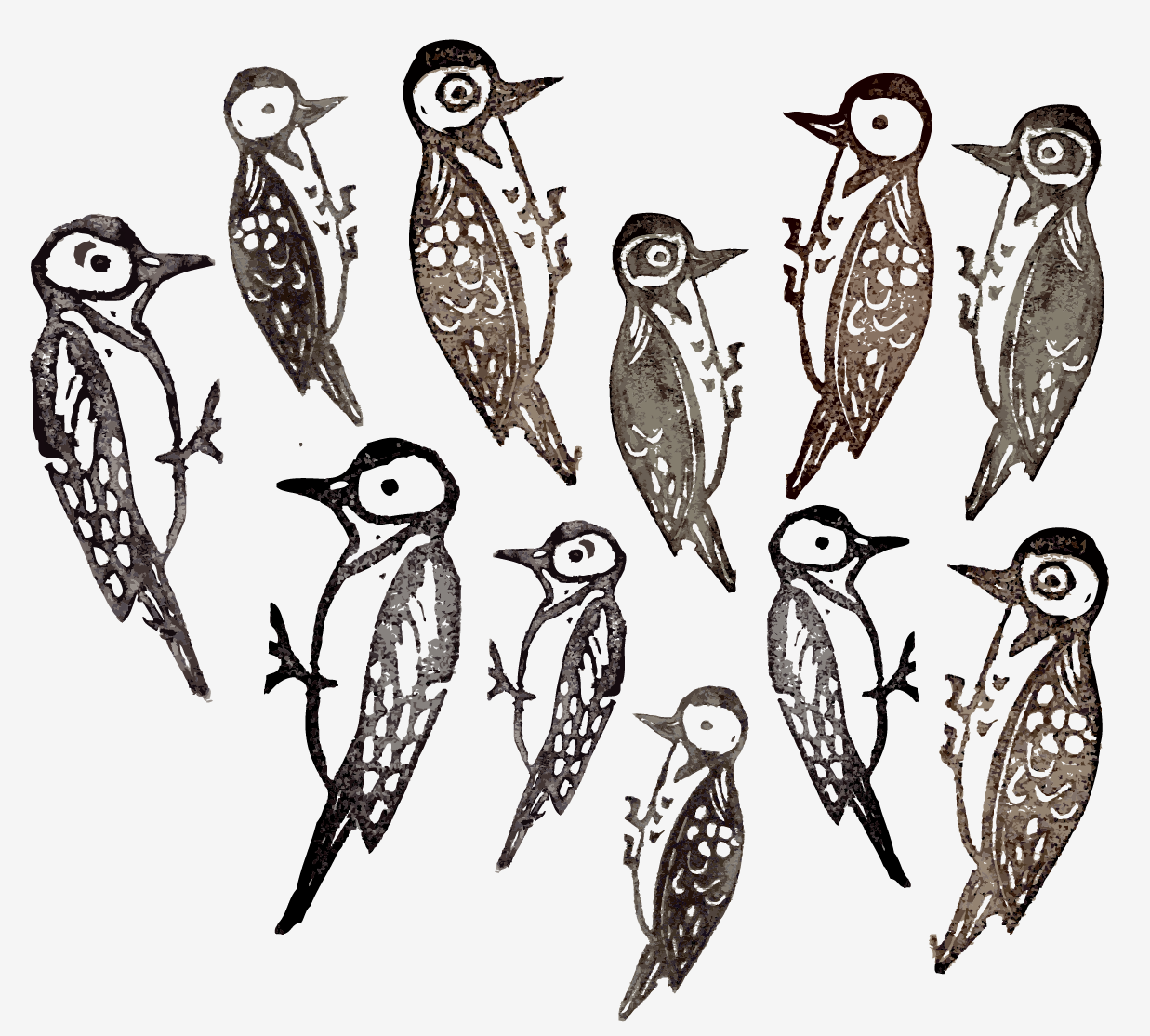
I started with some watercolour and inks.


 I scanned the pages in so that I could use the textures on the computer and try experimenting with some of the plants. I drew a quick bottle outline on Illustrator, popped some of my paintings inside, and here was my progress by the end of Day 1. 


Although I liked some of the inky textures, I didn't feel like this medium was giving me the style of drawing that would work for me. In my research I found some amazing examples of beautiful watercolour paintings and studies, but I know that this isn't a medium that I'm good at! I decided that I would try something different on Day 2. It can be pretty disheartening at this stage in a design, when I'm unsure what direction I'm taking, but it's best to stay positive and look at every trial as part of the process. I think every doodle and experiment contributes towards a final outcome, even if it seems like an unnecessary detour at the time!

On Day 2 of my design challenge I had a new hit of inspiration. One of the requirements of the brief was to incorporate a word or phrase into the design, so I decided that this might be an excellent excuse to include a pun (I do love a good pun.)

I was staring at my progress so far thinking 'This is terrible. My terrarium is terrible. In fact, it should be a terrorarium.' Bingo!


I stripped away all of the lush green elements that I'd built so far, and started with a messy canvas and a caption. Now, I could source some new inspiration that REALLY appealed to me! What sort of creepy plants and evil dwellers would inhabit a terrorarium? Could there be tentacles and venus fly traps and buried monster bones? Yes. Yes there could. At last, this was a concept that I could see working!

I started doodling again to get some new elements to play with. I also scanned some more inky textures and paint splats for extra murkiness. 


I still didn't feel confident with my drawings, but I was reminded of some old doodles I had from my university days of swirling sea-scapes. I liked the idea of having sinister curling vines around my 'terrors,' so I thought that these drawings might be a good place to start.


I took the original drawing scans and Live-Traced them in Illustrator. I liked the shapes as they were, but wondered what the negative spaces were like. I inverted the colours to find out.


This helped me to see what shapes I could use for my 'evil' plants. I started pulling some of the shapes away from the rest of the drawing, and I could see venus fly traps and curling vines starting to come together!


My favourite shape came from part of a wave shown below, and when I rotated it I could see it becoming part of the mouth of a venus fly trap. 


Finally, it felt like I was hitting on a style that I liked! I continued working with my abstract shapes and drawing new ones to build more venus fly traps. I also started adding eyes to create characters.


Now that I had my 'terrors,' I needed to build up my jar around them. I was really enjoying this technique so I created some new drawings to use.


Again, I Live-Traced them in Illustrator, inverted the colours, and started pulling out some of the lovely shapes. 


Now I had plenty of elements to work with! I used my original bottle shape and started building my design. Working in black and white helped me to focus on my layout, and I quite liked the contrast! The final designs will be displayed in an online gallery as a small thumbnail initially, so it was important to think about how our design would look at this tiny scale. I knew that contrasting colours should be a priority to help communicate the detail as clearly as possible.


I tried adding my bottle onto a background to get a feel for how the design could look. I used scans of inky marks and distressed papers, and went through lots of different stages and experiments.


During my trials, I accidentally changed the colours in the bottle, but this created the spookiest version yet!


I really liked the piercing white eyes, but felt that for this particular design challenge it was perhaps a bit too dark. 

I also wanted to create some creepy lettering for my text component, so I tried a few different styles. 


It had taken several days to reach this point in my design developments, but I felt like I finally had everything I needed to build my submission!

I tried keeping my layout minimal and my colours reduced:


I liked the bold contrasts but thought it needed extra depth and a more interesting palette. I went back to my Pinterest research and pulled out some images with colours that I loved. I follow an amazing blog called Oh Joy (http://ohjoy.blogs.com) and this is my go-to source for beautiful colour palettes and inspiring ideas! 

I singled out this photograph in particular for the colours, and created some swatches from it to inspire my own palette. All credit goes to Joy Cho of http://ohjoy.blogs.com!


With these swatches to hand, I started to inject more colour into my design. I tried adding a gradient to my bottle, then adjusted the transparency settings to emphasise the colours. This was already making a huge improvement! I kept the base of the bottle dark and rich and then faded out towards the top as if there was an eerie atmosphere being contained within...


I liked these colours, but experimented with a few more options before I settled.


I continued adding more swirls, texture and a 'Terrorarium' label to create this:


The submission was almost ready! Just as I was finishing off the final tweaks, I accidentally changed the Transparency setting on one of my background layers and created an exciting new colour way. (I have these happy accidents fairly often. I'll pretend this one was intentional...)


It was becoming even more difficult to choose the final colour scene! Eventually, I settled on a lush teal background. I carefully checked the submission guidelines and prepared my presentation board, and my submission was ready. My entry - TERRORARIUM!

I tried not to obsess over the 'competition' side of this challenge, and just focused on creating something fun and appealing that I could imagine developing further. I'm really happy with my outcome, and realise that this design would never have existed without the inspiring brief we were set! I would definitely recommend getting involved in any future Lilla Rogers Global Talent Search competitions for a refreshing new challenge. 

We had to keep our entries under wraps until the winners were announced, and you can see the full list of semi-finalists here: Lilla Rogers

Sadly I didn't make the cut, but after seeing all of the amazing entries I wasn't surprised! There were 999 submissions altogether, and only 50 could go through to the next round. I can't imagine how they were able to decide between so many lovely artworks! You can see the whole gallery of 999 entries, including mine, here: Global Talent Search

Monday, 21 July 2014

Design a Day Challenge - Day Seven

It's the final day of my design challenge!! This has been a really fun week, and although the designs were intended to be quick and carefree I've found it to be a very beneficial exercise to get back into a good pace of working. For my last design of the week, I decided to go for one of my favourite subjects... pandas!

I absolutely LOVE a panda and so this challenge actually came with a  lot of pressure to do them justice! I started with some inky mark making and doodling to get some elements to play with.


It doesn't look very productive at this stage, but once I'd scanned them into the computer and started combining some of the marks using Photoshop I was able to build characters with them.


It took a bit of trial and error to find a style that I liked, but once I found it I was able to create additional characters more quickly. I used a textured brushstroke to draw outlines and lightened the inky marks so that the eyes of the pandas wouldn't be lost.

I experimented with giving my characters things to hold and play with, and I also liked the idea of having some antisocial characters with their backs turned. Eventually, though, I decided to keep my layout simple and clean.


I was keeping my design time limited to a strict deadline, so I think I could continue working with these characters a lot more in the future. 


I've really enjoyed working on these daily design challenges, and the response I've had to the work  has been such a positive boost! I think I'll definitely be giving myself this Design a Day challenge again very soon!

Design a Day Challenge - Day Six

The design I picked for this challenge was another idea that I've had in my head for a long time! I had been imagining a forest of trees filled with little woodpeckers, using limited colours but lots of flashes of red for the birds' markings. I wanted my motifs to be quite simple but striking, so I decided to try and create the look of a textured block print.

To achieve this, I used a lino cutting tool and some erasers to make rubber stamps. This is a technique I've used a lot in the past!  Erasers can be soft and easy to carve, and the small size gives you a limited canvas but still offers a nice level of detail. Here are some scans of rubber stamps that I've made before. I really like the look of them once they've seen a bit of use and are coated in ink.


First, I roughly sketch out my motif on the surface of the rubber in pen. Then I use a sharp lino cutting too to start carving out the design.


I like to make prints of the stamp along the way as I'm carving it so that I can see how the design has progressed. This is the progress of the stamp above:


Once the stamp is finished, I usually try printing it in some different inks. Above I used an ink pad, and below I used calligraphy ink painted on with a brush. I love the way that ink can distort the motif and give you quite different effects. 


I made a second stamp with a woodpecker facing in the other direction. This is the creation of that design:


Now that I had some motifs, I was able to scan the pages into the computer and start working with them in Adobe Illustrator. I used the Live-Tracing tool on my stamps and simplified the motifs into the edgy, block printed look that I was after.


I added the red detailing by drawing rough shapes and layering them underneath the motifs. I wanted this to look blocky and imperfect as well to continue the 'printed' style.


Now that the birds were ready, I was able to start building my forest. I drew some tree silhouettes and added a little texture onto them. I changed the colours a lot as I was working on them! Eventually I settled on these muted tones. I used a 'Multiply' filter on the individual trees so that when I layered them up they 'multiplied' with the ones below, creating new overlapping colours. It's very subtle but I like this effect, and I think it's appropriate for the printed look that I was trying to achieve.


I then started placing my Woodpeckers on top, but I felt like the design was needing another layer of detail.


I drew a line of varying sizes of circles, and used Illustrator to make them into a paintbrush. This meant that I could draw with them in a continuous stroke.


I used this new brush to add 'pecked' holes into my tree trunks. 


Design a Day - Day Six complete! Woodpecker Spotting.


Once I had finished, I accidentally deleted my background colour, but I rather liked the result! I tweaked a couple of the trees and now have an alternative colour way. It's a bit fresher than the original.

Saturday, 19 July 2014

Design a Day Challenge - Day Five

Today I went to visit Chester for a change of scenery. I really enjoyed exploring the city and finding lots of lovely new inspiration! I made a list of even more new ideas which I may refer back to over the next few Design a Day challenges.
By the time I got back to my studio after my adventure I was left with very little time for today's challenge!
I decided to enjoy a bit of relaxed doodling and to go back to basics...

1 x felt marker
1 x fineliner
A multitude of bunnies.

The result? One page full of little critters. (89 in fact.)


Once I had scanned in the original page of artwork, I decided to leave it just as it was and didn't edit the drawings in any way. I think it would be interesting to try reworking the design into a repeat, and to overlap the bodies of the characters at the front. You can never have too many bunnies in my opinion!

Friday, 18 July 2014

Design a Day Challenge - Day Four

If I don't have any pressing business to attend to in my mornings, I like to catch up on some of my favourite blogs. One of them is the fabulous http://crumbsandpetals.com. This blog has a fantastic mix of subjects for its daily posts including delicious recipes, art and design, gardening, good reads and general life-enriching finds and experiences. I would definitely recommend subscribing!

Today's post was a round-up of lobster based design goodies: http://crumbsandpetals.com/2014/07/friday-wishlist-the-world-is-your-lobster/


Not only were the products beautifully designed, but this post was laden with accompanying lobster puns. I love a good fish pun. 


It reminded me of another design that has been in the back of my head for some time and I decided to realise this idea for today's design. I'm naming today Fish Pun Friday!


My first requirement for this task was some fishy drawings. I opted for a dip pen and ink to get some good watery textures.


They're supposed to be flatfish, or plaice. It was quite a tricky drawing task!

My next step was to scan them and import them into Adobe Illustrator. I decided to Live-Trace my drawings to simplify them and adjust the faces. Here's how they looked once they were traced into vectors and tweaked a bit.


I find it fascinating to see the way that Illustrator can change your drawings depending on how much tone and texture you allow it to trace.

I adjusted them a bit more, added a background colour and some additional paint splatters. Finally, I added my text, which was also hand-drawn and scanned in. 


Today's Design - Your Plaice or Mine?