Monday 21 July 2014

Design a Day Challenge - Day Seven

It's the final day of my design challenge!! This has been a really fun week, and although the designs were intended to be quick and carefree I've found it to be a very beneficial exercise to get back into a good pace of working. For my last design of the week, I decided to go for one of my favourite subjects... pandas!

I absolutely LOVE a panda and so this challenge actually came with a  lot of pressure to do them justice! I started with some inky mark making and doodling to get some elements to play with.


It doesn't look very productive at this stage, but once I'd scanned them into the computer and started combining some of the marks using Photoshop I was able to build characters with them.


It took a bit of trial and error to find a style that I liked, but once I found it I was able to create additional characters more quickly. I used a textured brushstroke to draw outlines and lightened the inky marks so that the eyes of the pandas wouldn't be lost.

I experimented with giving my characters things to hold and play with, and I also liked the idea of having some antisocial characters with their backs turned. Eventually, though, I decided to keep my layout simple and clean.


I was keeping my design time limited to a strict deadline, so I think I could continue working with these characters a lot more in the future. 


I've really enjoyed working on these daily design challenges, and the response I've had to the work  has been such a positive boost! I think I'll definitely be giving myself this Design a Day challenge again very soon!

Design a Day Challenge - Day Six

The design I picked for this challenge was another idea that I've had in my head for a long time! I had been imagining a forest of trees filled with little woodpeckers, using limited colours but lots of flashes of red for the birds' markings. I wanted my motifs to be quite simple but striking, so I decided to try and create the look of a textured block print.

To achieve this, I used a lino cutting tool and some erasers to make rubber stamps. This is a technique I've used a lot in the past!  Erasers can be soft and easy to carve, and the small size gives you a limited canvas but still offers a nice level of detail. Here are some scans of rubber stamps that I've made before. I really like the look of them once they've seen a bit of use and are coated in ink.


First, I roughly sketch out my motif on the surface of the rubber in pen. Then I use a sharp lino cutting too to start carving out the design.


I like to make prints of the stamp along the way as I'm carving it so that I can see how the design has progressed. This is the progress of the stamp above:


Once the stamp is finished, I usually try printing it in some different inks. Above I used an ink pad, and below I used calligraphy ink painted on with a brush. I love the way that ink can distort the motif and give you quite different effects. 


I made a second stamp with a woodpecker facing in the other direction. This is the creation of that design:


Now that I had some motifs, I was able to scan the pages into the computer and start working with them in Adobe Illustrator. I used the Live-Tracing tool on my stamps and simplified the motifs into the edgy, block printed look that I was after.


I added the red detailing by drawing rough shapes and layering them underneath the motifs. I wanted this to look blocky and imperfect as well to continue the 'printed' style.


Now that the birds were ready, I was able to start building my forest. I drew some tree silhouettes and added a little texture onto them. I changed the colours a lot as I was working on them! Eventually I settled on these muted tones. I used a 'Multiply' filter on the individual trees so that when I layered them up they 'multiplied' with the ones below, creating new overlapping colours. It's very subtle but I like this effect, and I think it's appropriate for the printed look that I was trying to achieve.


I then started placing my Woodpeckers on top, but I felt like the design was needing another layer of detail.


I drew a line of varying sizes of circles, and used Illustrator to make them into a paintbrush. This meant that I could draw with them in a continuous stroke.


I used this new brush to add 'pecked' holes into my tree trunks. 


Design a Day - Day Six complete! Woodpecker Spotting.


Once I had finished, I accidentally deleted my background colour, but I rather liked the result! I tweaked a couple of the trees and now have an alternative colour way. It's a bit fresher than the original.

Saturday 19 July 2014

Design a Day Challenge - Day Five

Today I went to visit Chester for a change of scenery. I really enjoyed exploring the city and finding lots of lovely new inspiration! I made a list of even more new ideas which I may refer back to over the next few Design a Day challenges.
By the time I got back to my studio after my adventure I was left with very little time for today's challenge!
I decided to enjoy a bit of relaxed doodling and to go back to basics...

1 x felt marker
1 x fineliner
A multitude of bunnies.

The result? One page full of little critters. (89 in fact.)


Once I had scanned in the original page of artwork, I decided to leave it just as it was and didn't edit the drawings in any way. I think it would be interesting to try reworking the design into a repeat, and to overlap the bodies of the characters at the front. You can never have too many bunnies in my opinion!

Friday 18 July 2014

Design a Day Challenge - Day Four

If I don't have any pressing business to attend to in my mornings, I like to catch up on some of my favourite blogs. One of them is the fabulous http://crumbsandpetals.com. This blog has a fantastic mix of subjects for its daily posts including delicious recipes, art and design, gardening, good reads and general life-enriching finds and experiences. I would definitely recommend subscribing!

Today's post was a round-up of lobster based design goodies: http://crumbsandpetals.com/2014/07/friday-wishlist-the-world-is-your-lobster/


Not only were the products beautifully designed, but this post was laden with accompanying lobster puns. I love a good fish pun. 


It reminded me of another design that has been in the back of my head for some time and I decided to realise this idea for today's design. I'm naming today Fish Pun Friday!


My first requirement for this task was some fishy drawings. I opted for a dip pen and ink to get some good watery textures.


They're supposed to be flatfish, or plaice. It was quite a tricky drawing task!

My next step was to scan them and import them into Adobe Illustrator. I decided to Live-Trace my drawings to simplify them and adjust the faces. Here's how they looked once they were traced into vectors and tweaked a bit.


I find it fascinating to see the way that Illustrator can change your drawings depending on how much tone and texture you allow it to trace.

I adjusted them a bit more, added a background colour and some additional paint splatters. Finally, I added my text, which was also hand-drawn and scanned in. 


Today's Design - Your Plaice or Mine?


Thursday 17 July 2014

Design a Day Challenge - Day Three

For my design challenge today, I decided to go for a raccoon print. I have a list pinned up on my studio wall of designs or subjects that I've been mulling over for a while, and raccoons have been on there since I started writing it. I think there are so many lovely characteristics about them, and with their cheeky eye masks I could have a lot of fun experimenting with misbehaving characters! For today's challenge, though, I just wanted to focus on getting a style of drawing that suited the subject. I went through lots of materials and options before finding something that I felt was working!
To start, I just did some quick doodles and sketches in different pens and ink to get a feel for the look of a raccoon.


These helped me to decide on the face and body shapes, so I moved onto the computer to doodle some more.


These drawings were just created in Adobe Illustrator using my Wacom Tablet and pen. I like to keep the fidelity of my pencil really low, so that it registers every tremble and wobble in my drawings. This gives me the crude, hand-drawn look that I like. In some situations this level of accuracy isn't appropriate, and it's better to keep the fidelity nice and high so that Illustrator will smooth out the irregularities in the vector drawings for you. (I personally prefer wibbly lines and extra texture in my own work!)

Once I had some basic faces, I drew a body, added some texture and was left with this:


I'm still not satisfied that I've created the quirky, appealing character that I was after, but for the purposes of today's challenge he will do the job.

Once I had the basic face designed, I was able to tweak it and create new characters. I also drew new bodies and tried 'flipping' my characters (this can be a nice shortcut to double your number of motifs very quickly!)

Finally, I popped all of my characters into a simple repeat. Ta-da! Design a Day Challenge, Day Three - A Gaze of Raccoons (That's the correct collective noun - I looked it up. Wow, I'm learning new things every day with these challenges!)


Wednesday 16 July 2014

Design a Day Challenge - Day Two

Along with doodling animals, one of my favourite crafty things to do is collage. Recently I've been experimenting with using the Adobe programs to create digital collage effects, and this was something I decided to try for today's design challenge.

I've often been inspired by the beautiful paper cut work of Su Blackwell and this week I spotted one of her artworks while I was browsing on Pinterest. (Check out her website and work; it's phenomenal! http://www.sublackwell.co.uk) I was thinking about it today when I sat down at my computer.

First, I needed to choose my subject. It's been a beautiful sunny day outside, so I thought a summery dragonfly was nice and appropriate. I drew the vector shapes for my motif and kept it very simple so that it would be easy to collage.


For fun, I quickly popped it into a repeat pattern and added a coloured background. I copied the silhouettes of the dragonflies, coloured them in a darker teal and offset them from the originals to create another layer of interest. The result is very simple but quite fun.


Sometimes I find that playing with the layout early on can give me a better idea of how I would like the final design to look. 

For this design, I wanted to use paper textures to build my dragonfly, inspired by the paper sculptures of Su Blackwell. I found an old folder on my computer with scans of various papers and used these. Adobe Illustrator has a fantastic tool for creating collage effects using Clipping Masks. This allows you to use a vector shape as a 'stencil' to cut out an image or a collection of images underneath. Using each vector shape in turn, I created my collage. I also added Drop Shadows to give the design some depth.


I layered up some extra textures and brushes on top, and then put the motif into a repeat pattern.

Again, I was limiting myself to a tight time deadline, so here's the design for Day Two - Paper Fly.
I enjoyed this style of working, so I'd like to continue playing with this idea of 'digital' paper craft in future designs.


Design a Day Challenge - Day One

Yesterday was my first day of the Challenge, so I set myself a strict minimal time limit to get the ball rolling. I grabbed my Wacom pen and and tablet, fired up Adobe Illustrator and set to work.

Step 1 - Design a Character

Quickly I drew out the basics of a character. Fat body, tail, stripes... I was going for a cat. Here's how the character developed:

I usually run through several options before finding something that I like. In this situation, I was battling the clock so my amendments were fast and furious!

Step 2 - Add Variations

Next, I decided to make a few characters by tweaking the faces. Pinky cat is very jolly, but ol' bluey is feeling gloomy. Why? Who knows. There's a story behind this design; a story for another day perhaps. Greeny is undecided. 


Step 3 - Make a Repeat

I opted for a repeating pattern with this design since I could toss the characters around quite freely. This was a very quick layout since my time limit was about to expire!! I liked the shapes that the tails made weaving around in the repeat.


And there we have it. Day One - Tumbling Cats.

A Design A Day Challenge

Recently, I’ve hit a bit of a creative wall and I’ve been struggling to find the energy to create new work. I have the ideas but I’m finding it all too easy to blame a lack of time for this designing slump. It’s easier to make endless cups of tea or to tweak existing designs than to sit down with a blank pad of paper and begin something afresh. What happened?!

I’ve decided to set myself a challenge to try and rekindle my love for drawing, creating and experimenting. I know that I’m at my happiest when I’m doodling some new characters and taking the time to really enjoy the process, so I’ve set some basic rules to get back into the creative bubble.

1) Create one ‘Design a Day’ for a week

That’s it - just one design. It can be a pattern, a placement, a doodle, an illustration or a mix of elements. I have to produce something every day for a week, and if it’s a success, I’ll extend the time scale.
I’ll set myself time limits on some days if I have a lot of other jobs to fit in too, and if my timetable is a bit more open then I’ll devote that extra time to the Design of the Day.
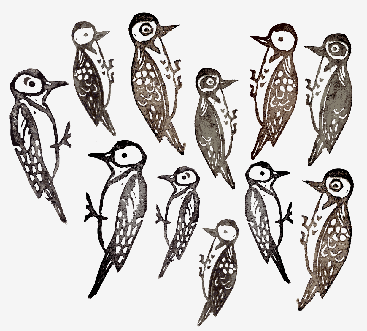

2 ) Experiment

Rule two - I’m not allowed to use the same materials or processes as the day before. I love trying new things but these days I’m finding that the creeping voice of doom is suppressing this freedom to experiment. It tells me: “I don’t really have time to try this is if isn’t going to work… Free time is a bit short at the moment so everything I do has to mean something.” And this leads neatly onto the final rule…


3) No Pressure - JUST DO SOMETHING!

The designs might not be my proudest achievements, but I firmly believe that everything you create is leading somewhere important eventually. If the techniques I’m trying aren’t working, then I’ve only spent one day’s design time on it. It’s always good to try out new ideas to see if they’re worth continuing over a longer time frame. 

When I used to work in a design studio, time pressure had a huge impact on my work and processes. I’m certain that I produced some of my best work with this tight time limit and the pressure that every design had to count, but it also stifled my need to experiment and to have a bit of fun. 

Now, this is my own creative business, and if I can’t enjoy the designing element then where’s the joy? It certainly isn’t in the book-keeping and admin! So deep breath, fears aside, and let’s create!!


Do you find yourself in a creative slump sometimes? What are your tips for getting back into the zone?

Whew... Six Months on!

Hello again!

It's been a busy old time at the Clo's Line studio over the past few months!

I've had the pleasure of working on some collaborative commissions, including a very exciting new avenue for Mr Fox... Watch this space!

I've also launched a new product line on the Clo's Line website, featuring one of my favourite subjects... TEA!!


The range offers cards and gift wrap featuring tea, noodles and sushi (and if you look closely in the gift wrap you can even spot a cheeky fox hiding in there!)


These designs were developed from some of the sketchbook work that I created in my final year at university. Here's a peak at some of the original hand cut collages:


I worked with the lovely Mairi Helena Photography (http://www.mairihelenaphotography.co.uk) to take some great product shots, and the range is now stocked online and in the Flat Cat Gallery in Lauder. Yay!